March 2021
Rethinking Irorun — a P2P lending app that offers micro loans to users.

Overview
Irorun is a digital lending application that offers microloans to eligible users. Irorun allows individuals to access cash without the hassle that comes with using a traditional banks or credit unions. Interest rates are lower compared to traditional banks. The application is owned and managed by Lendsqr (a lending-as-a-service cloud platform for licensed lenders) as a demo app to drive sales for their Whitelabel and custom-made lending applications.
Understanding the users
With help from the product manager, we were able to address the usability issues and define what needed to be done in the redesign. Due to time constraints, the research methods that gave faster results were used.
- Feedback from Freshdesk: Users reached out via Freshdesk on the website to give insights into their usability issues and pain points.
- Feedback from Lenders: Irorun is the base app for the other apps managed by Lendsqr which are implemented for a lot of lenders. The lenders were able to give feedback about their users' complaints.
- Play Store and App Store reviews: Studied the reviews on Play Store to be better understand the issues users are facing.
Problem statement
- Looking at the feedback and the reviews from Store, it was clear that customers were having issues with the sign-up and loan request process. This led to customers dropping off at these two points which are essentially key to the loan application experience.
- From the UX audit done by me, I noticed there was a lot of inconsistency in the design of the app which made some elements look out of place.

Goals and objectives
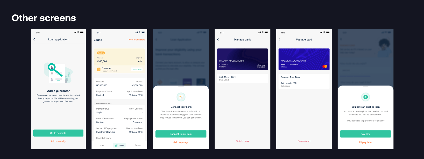
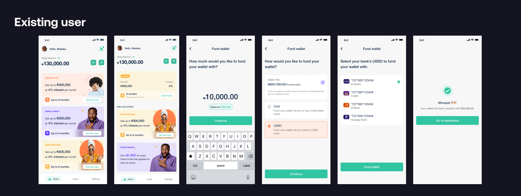
- Optimization of the Loan Application Experience: Improve the experience in order to help users fulfill their needs and navigate through the app with ease. Addition of new features where it's needed to fill the loopholes in the overall flow.
- Minimal Design: Carefully designing every element to ensure a clear and consistent look. Improve the overall look and feel to give a modern, happy, and colorful look.
Improvements
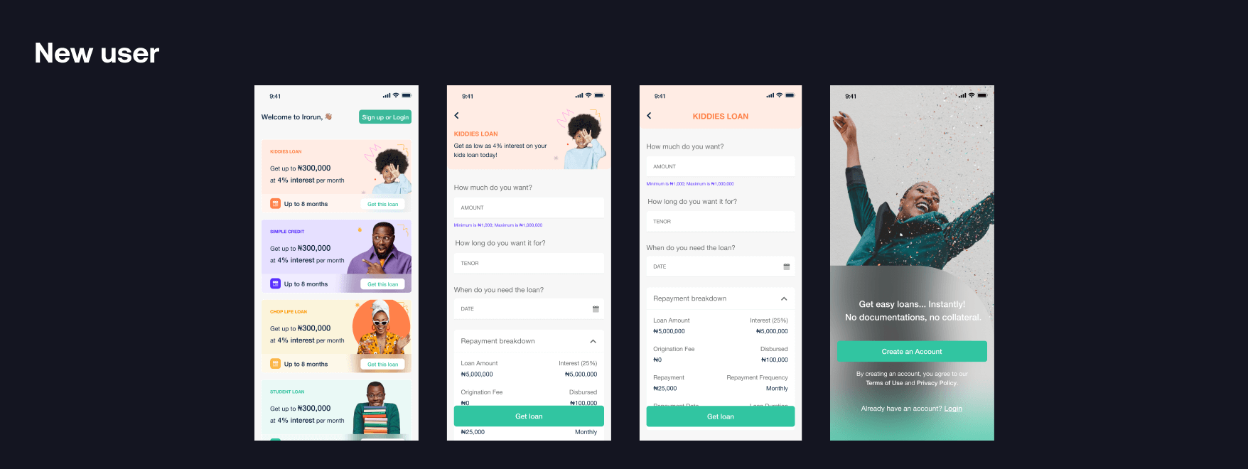
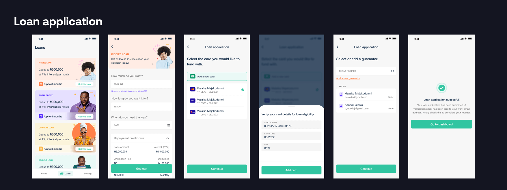
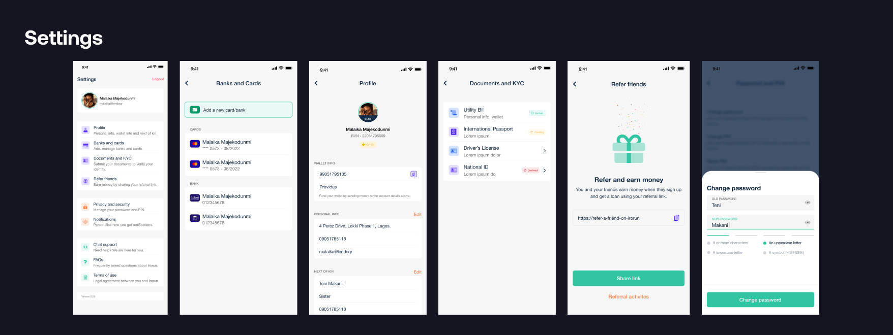
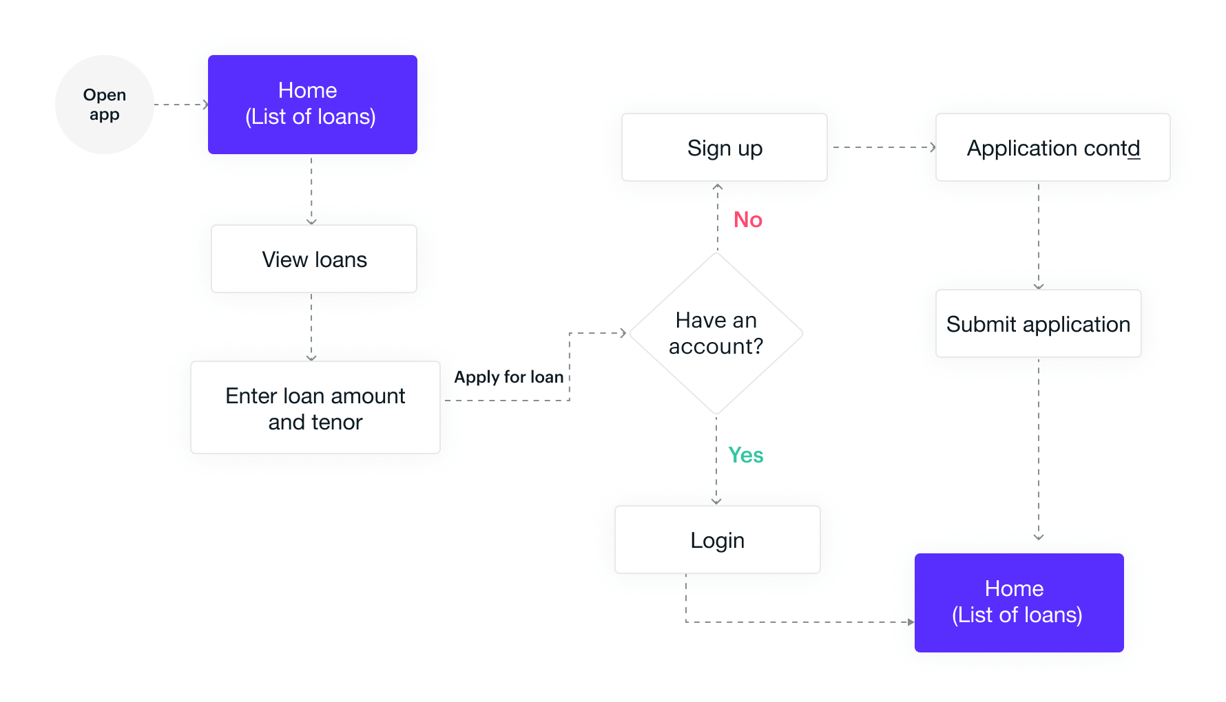
From the feedback we got, the focus was on improving the onboarding and loan application experience.
Considering that borrowers wanted to know what they were getting into, the first interaction of users with the app provides an insight into the available loan products. Users can also get an immediate estimate of the amount accessible on a particular loan product before applying. I was also able to reduce the number of steps users needed to get through when onboarding from 10 to 6 steps reducing the amount of clicks and screens.
Wireframes
I explored different layouts and components for the app to create low-fidelity wireframes. Experimenting resulted in different variations of the layouts and components before reaching the final design.
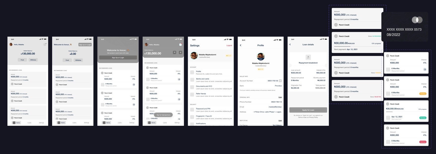
After several iterations, I was able to align with the team on which wireframes resonates well with our goal of the redesign before moving to high fidelity.
Style guide
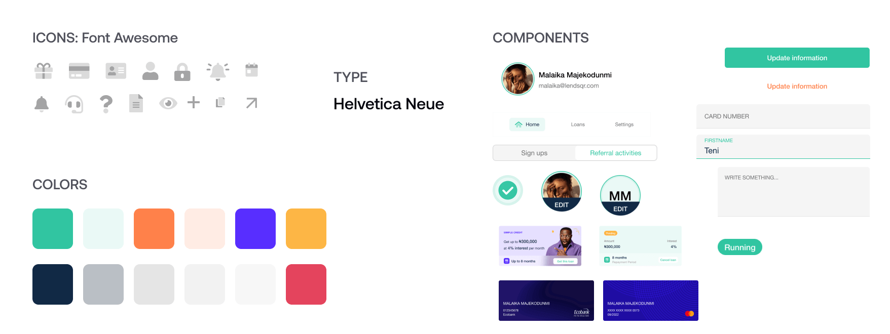
Since we were going for a modern look, I choose duotone elements to give that effect and also gave a friendly tone.
Tool used
All the designs and prototyping were done using Figma. I also used the Figma mobile app for prototyping and testing (in-house) in order to create an ideal case scenario of a user using it.
Conclusion
Since I was leaving, I didn't have the luxury of time to see it launch. If I had more time, I would conduct interviews and do some observation using data analytics to gain more insights as to how users are navigating through, how much users are converted, and if there are any pain points that may exist and are causing a problem for users.
